rock tarot — illustration & design
This project began in 2019, sparked by a curiosity about Tarot and the symbolism behind the cards. I’ve always been somewhat skeptical of mysticism and esotericism, so I decided to challenge myself artistically by exploring a theme I wasn’t entirely comfortable with and knew very little about.
I researched a wide range of references, including the Rider–Waite Tarot — one of the most widely known decks since its first publication in the 1910s. Through books and online sources, I discovered countless interpretations of Tarot, each with its own themes, visual languages, and artistic visions.
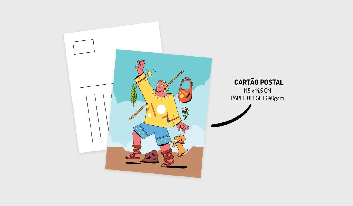
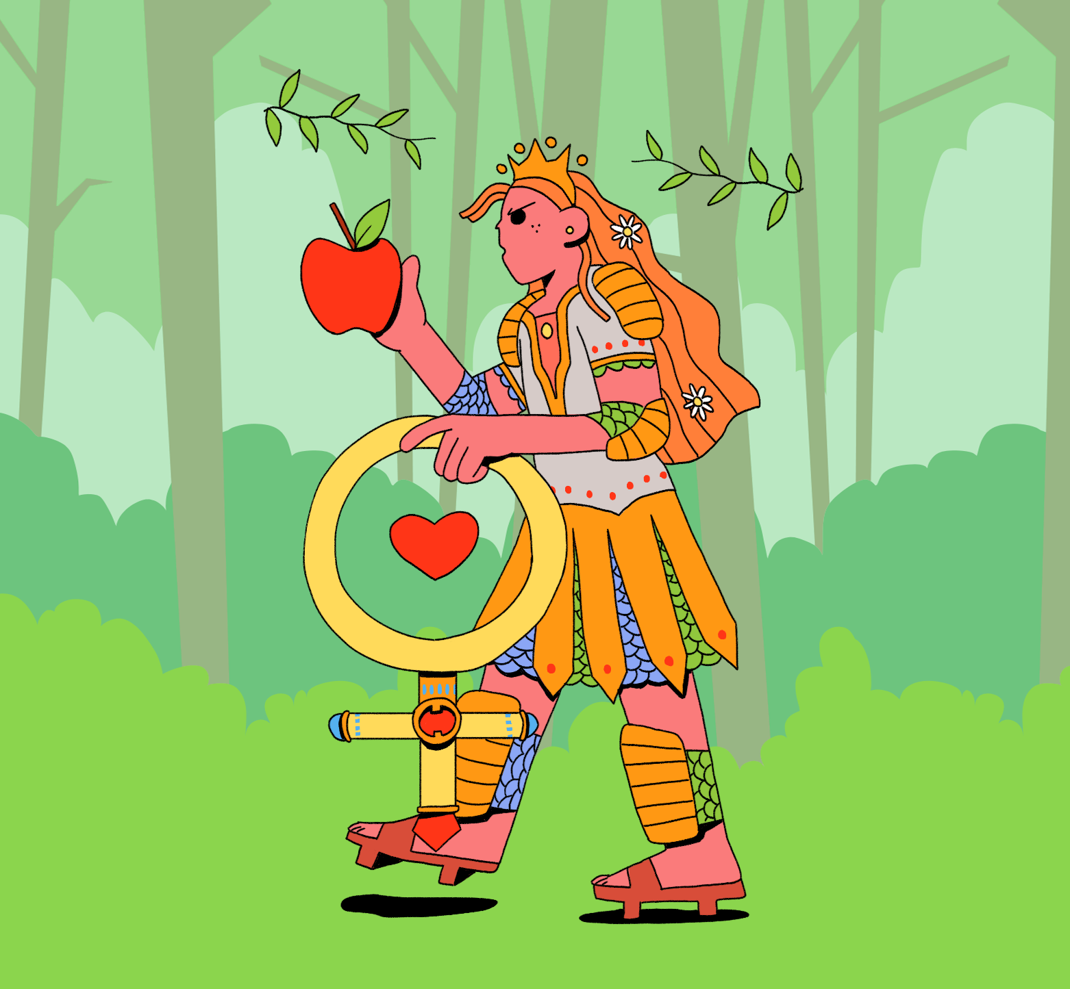
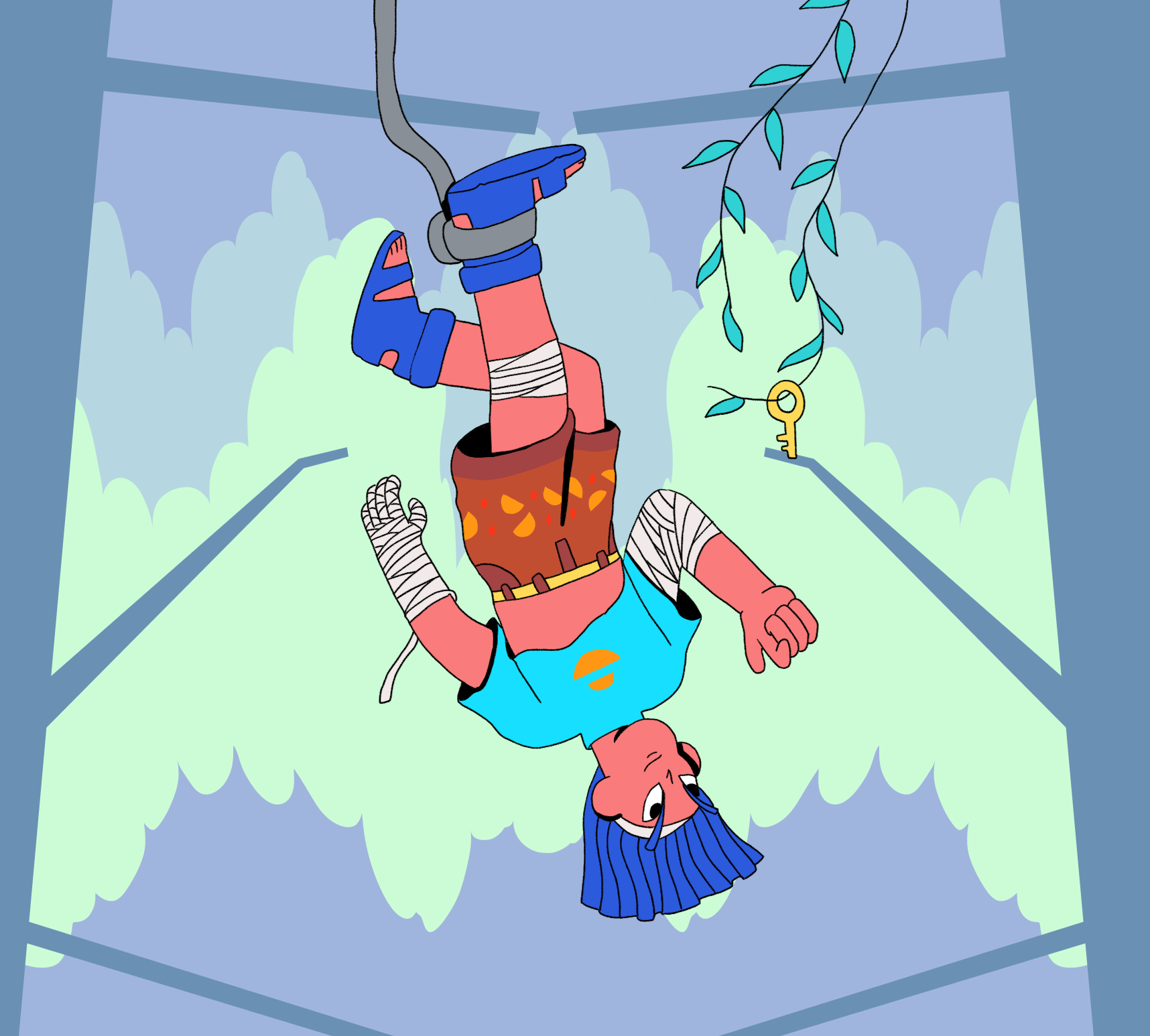
After this research phase, I decided to illustrate my first card: The Fool. I chose it because it appeared during a Tarot reading a friend did for me as a piece of advice — to take risks, embrace spontaneity, step into the unknown, and trust my instincts. My first attempt didn’t work; I didn’t connect with the style I was exploring, and it didn’t reflect the direction I was unconsciously searching for.
A few months later, after experimenting more deeply with my own artistic language, I gave The Fool a second chance — and everything clicked. Once I finished that card, I couldn’t stop. One illustration led to another until I had completed the entire deck.
role — illustration & graphic design (brand, packaging)
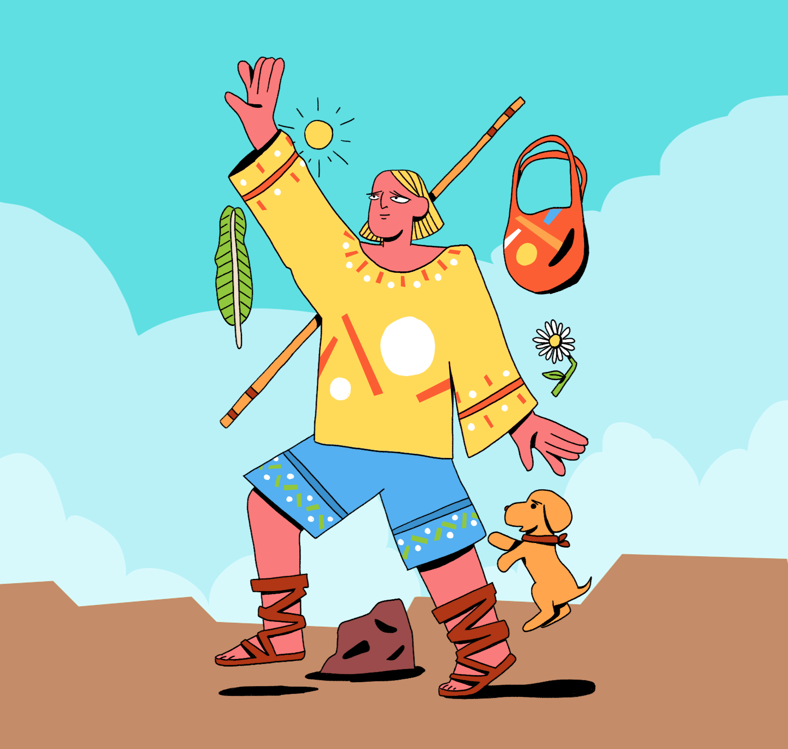
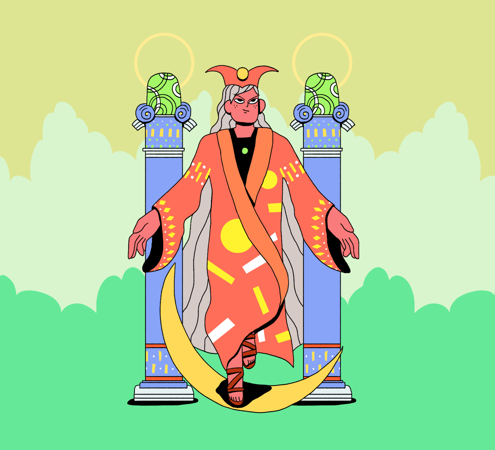
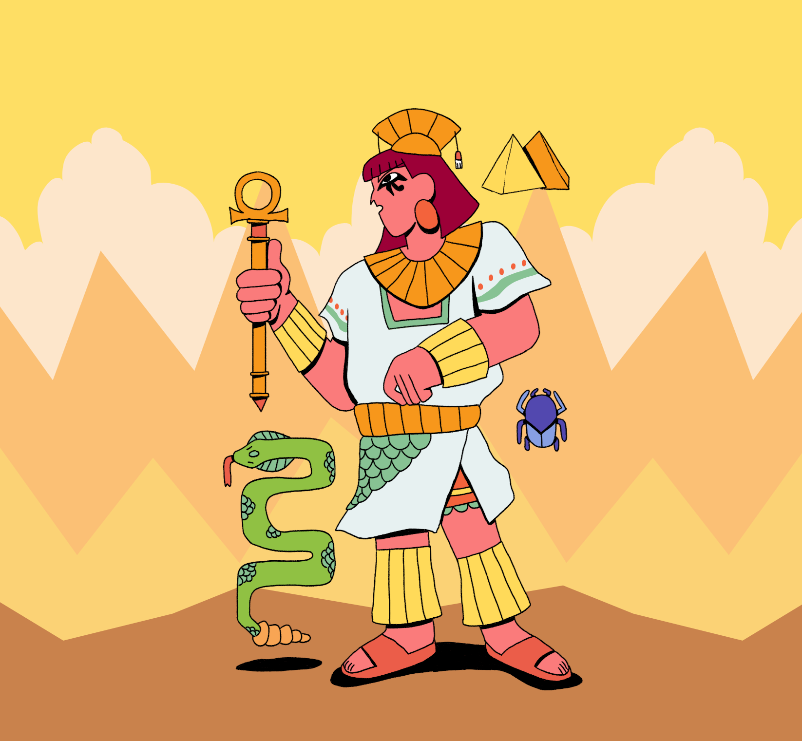
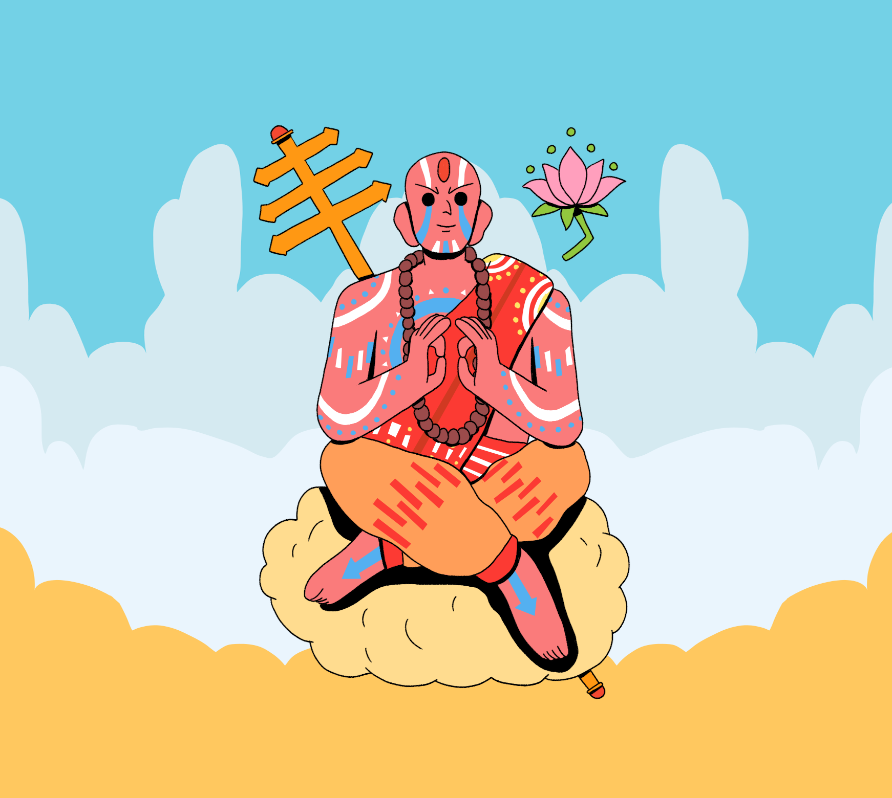
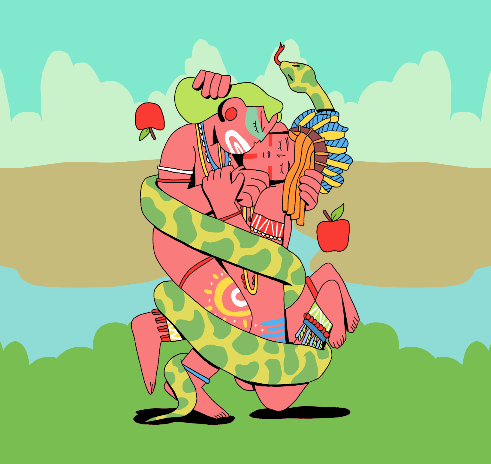
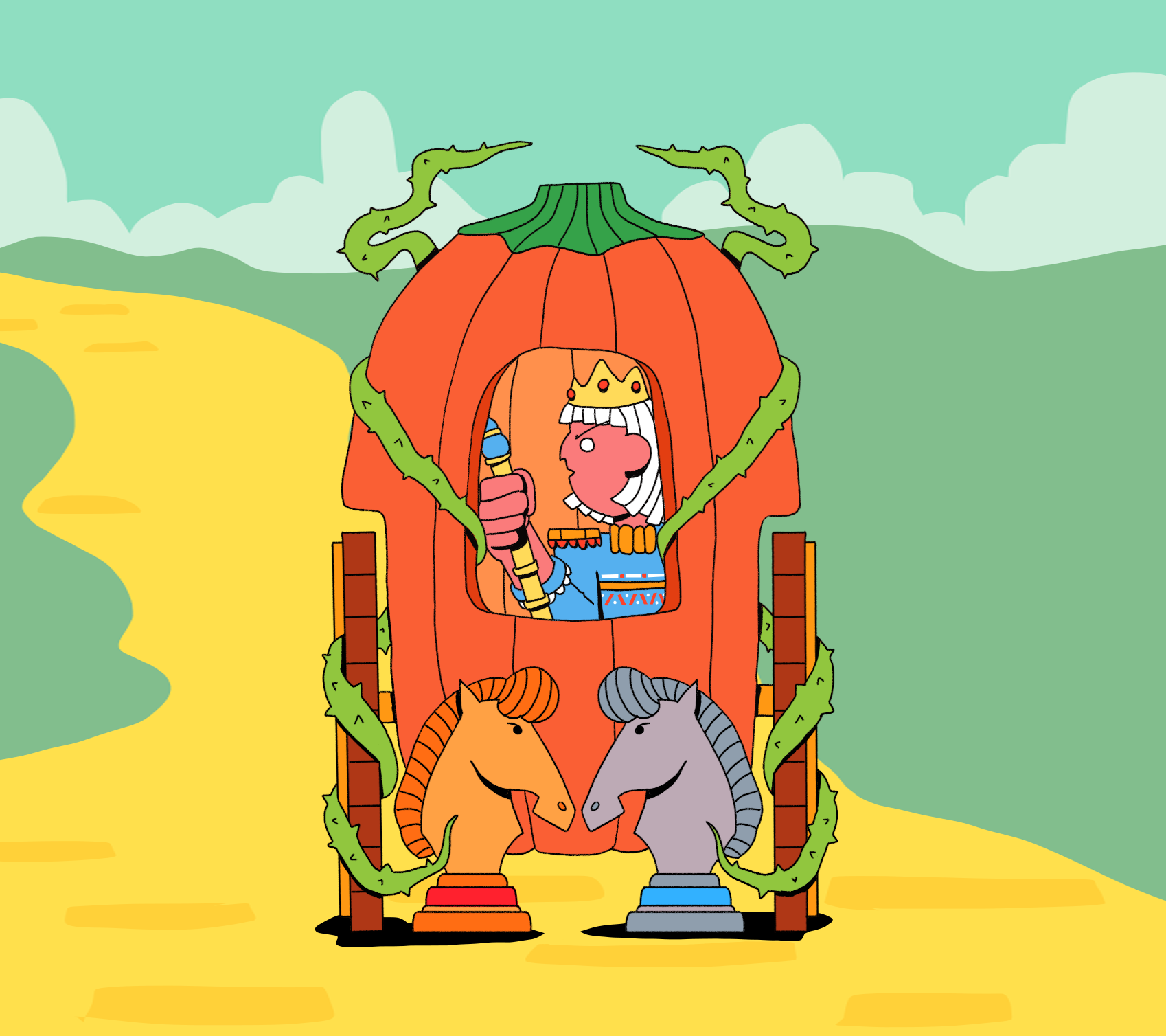
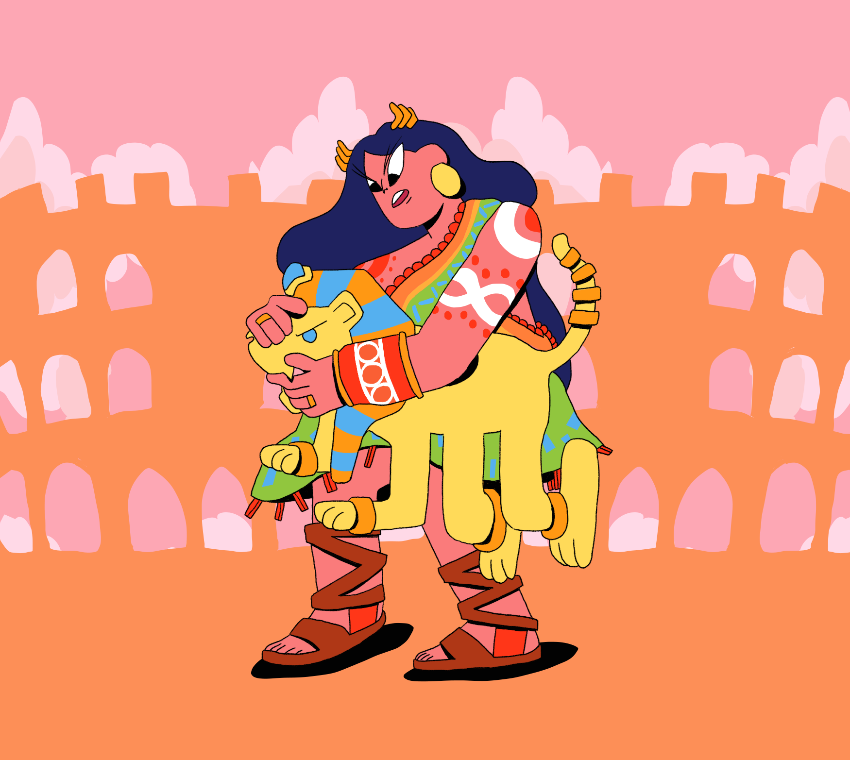
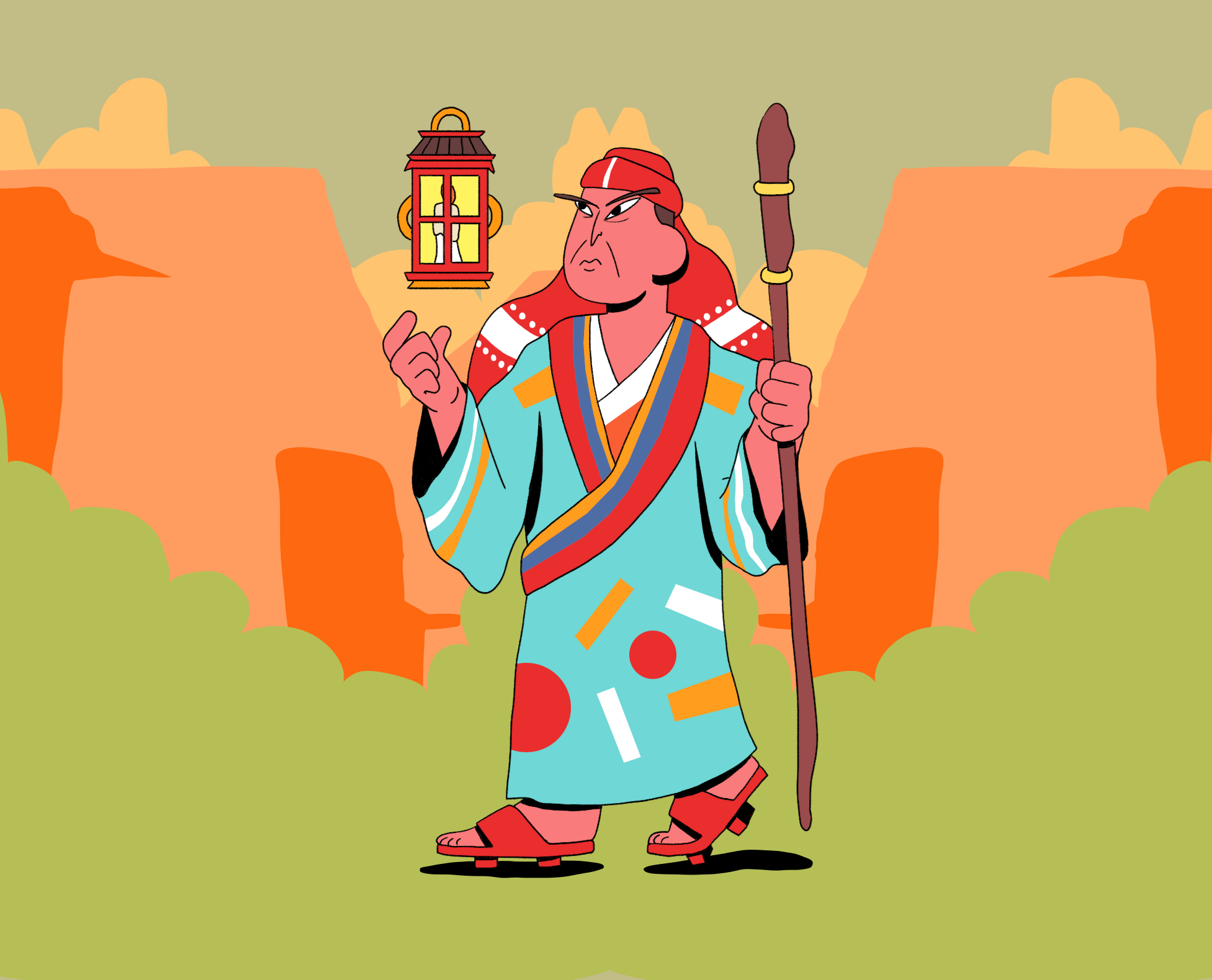

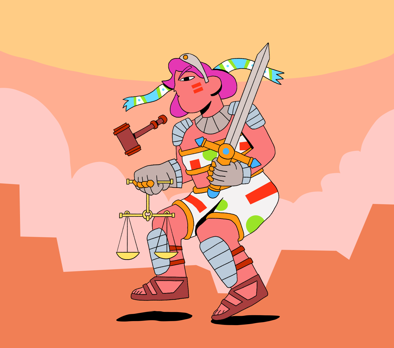
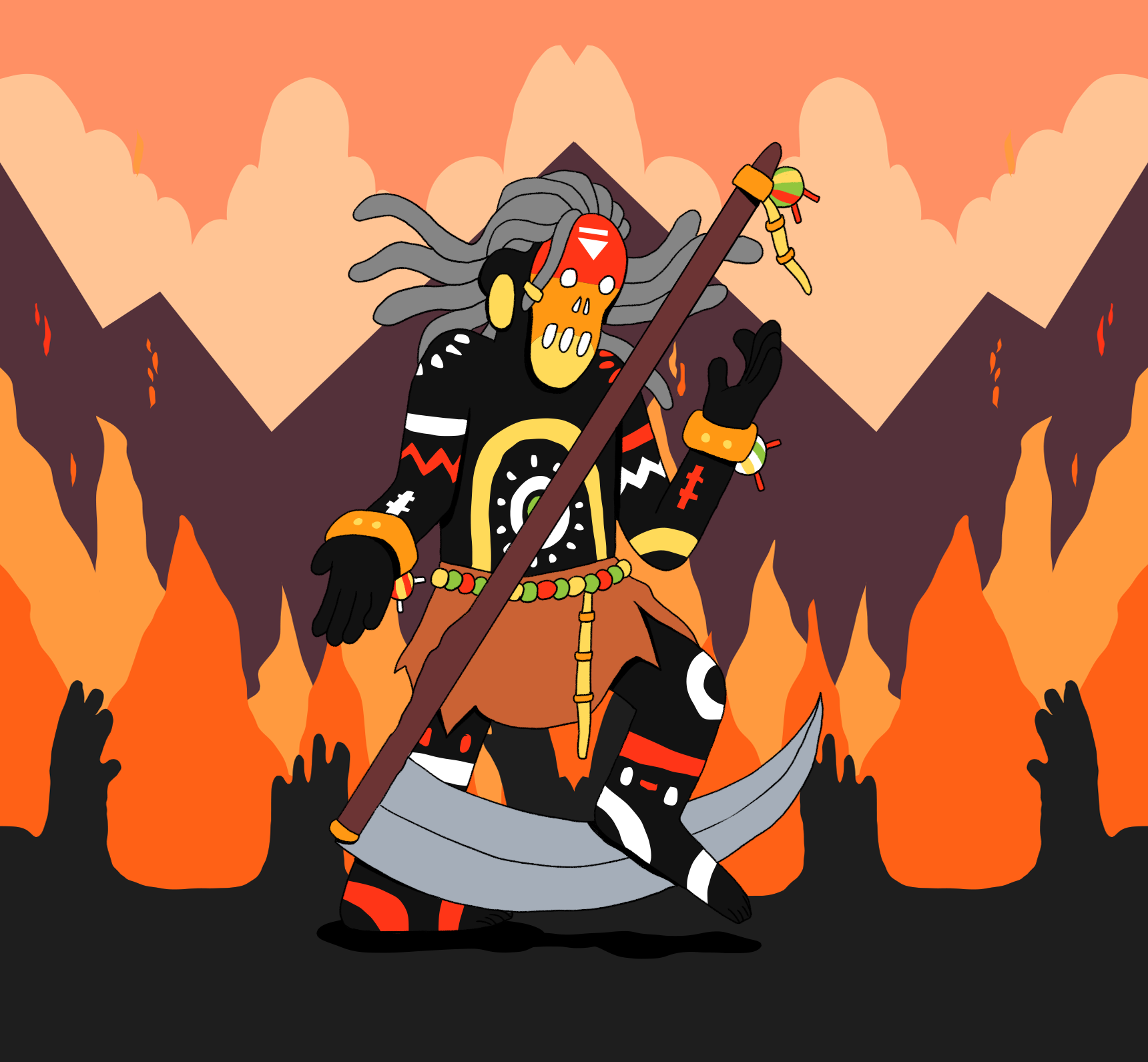
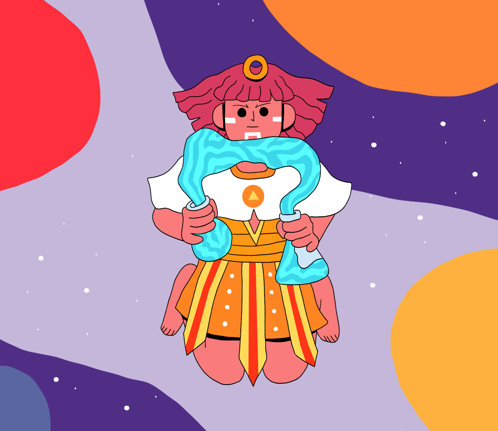
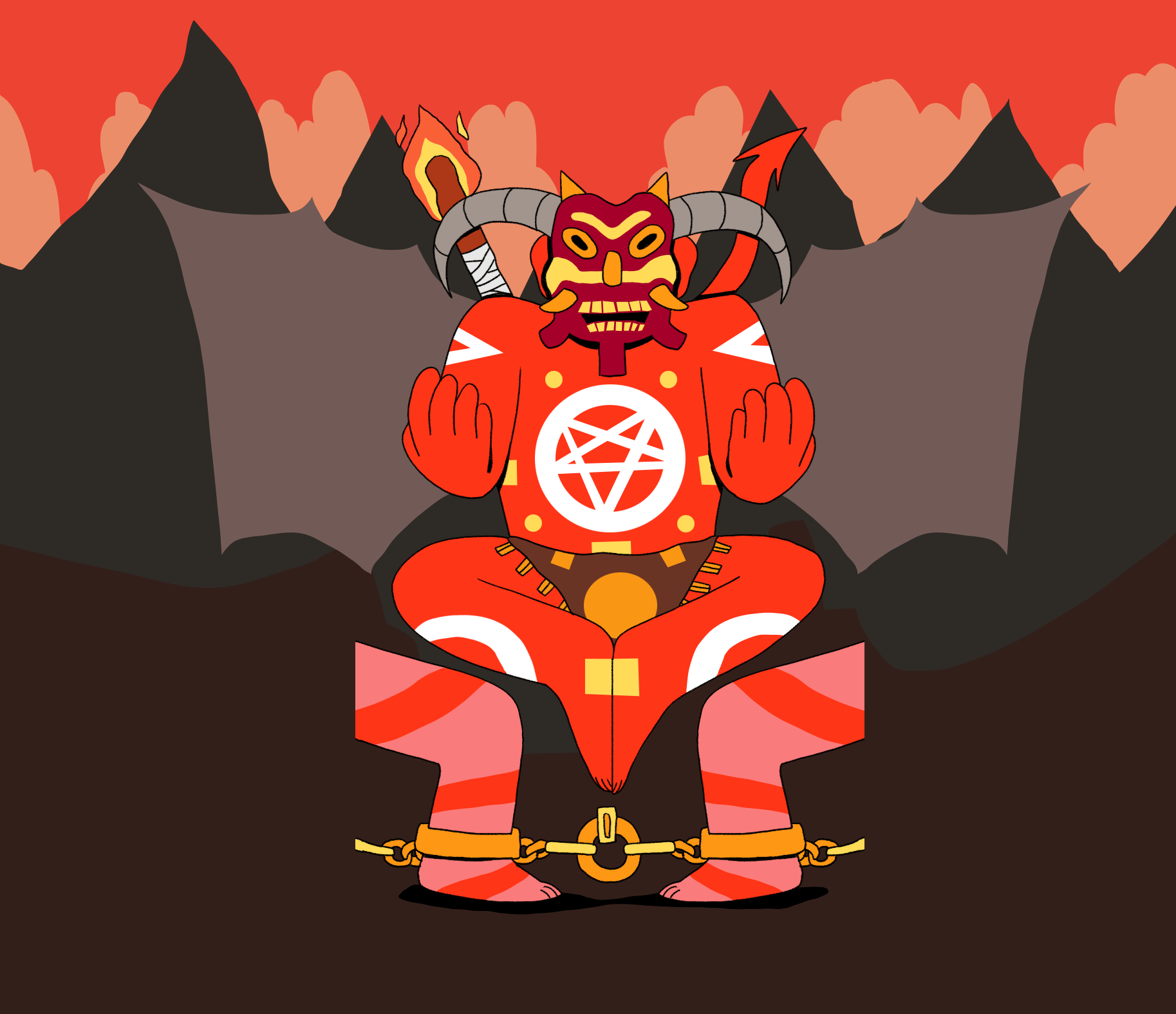
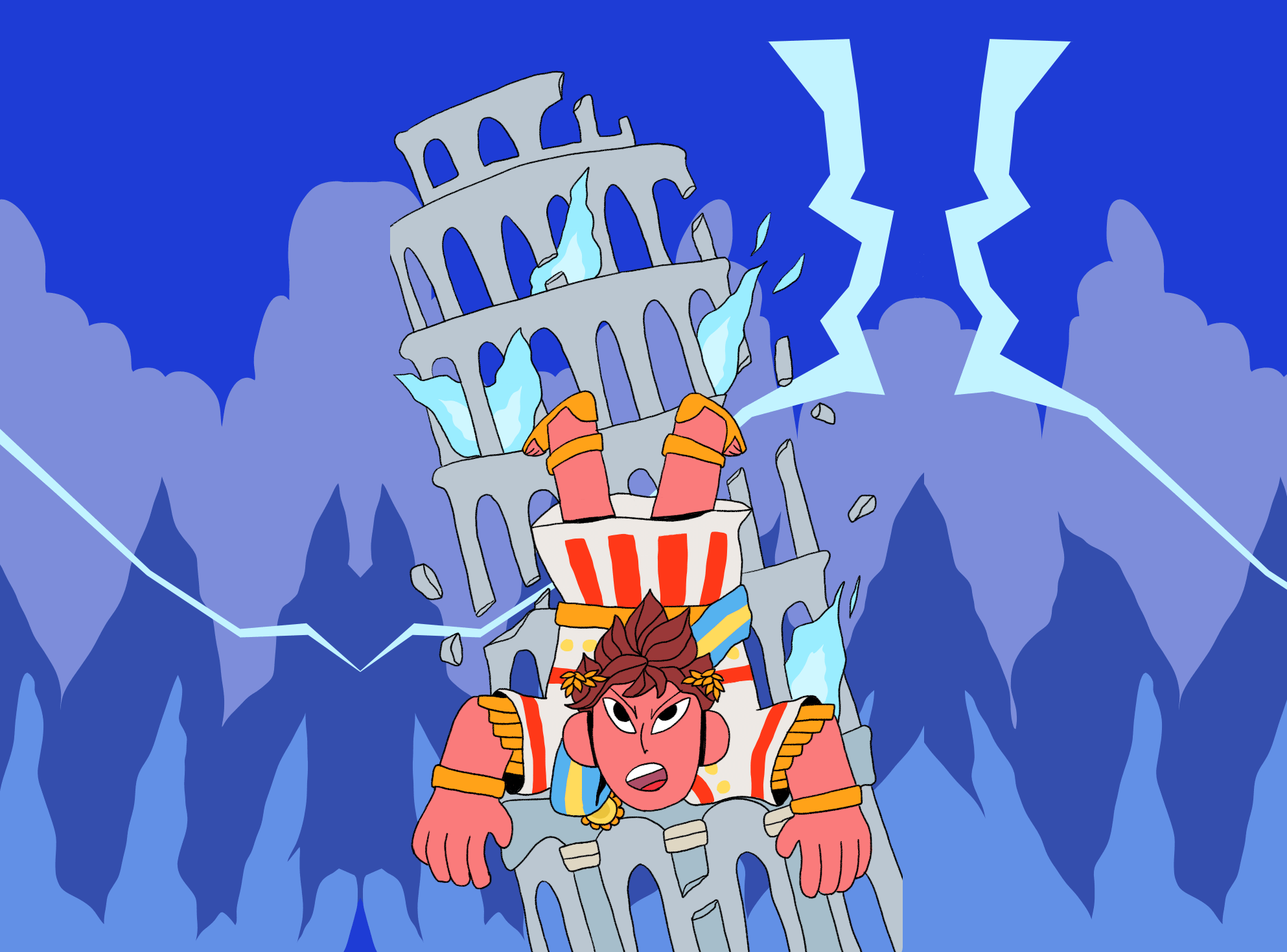
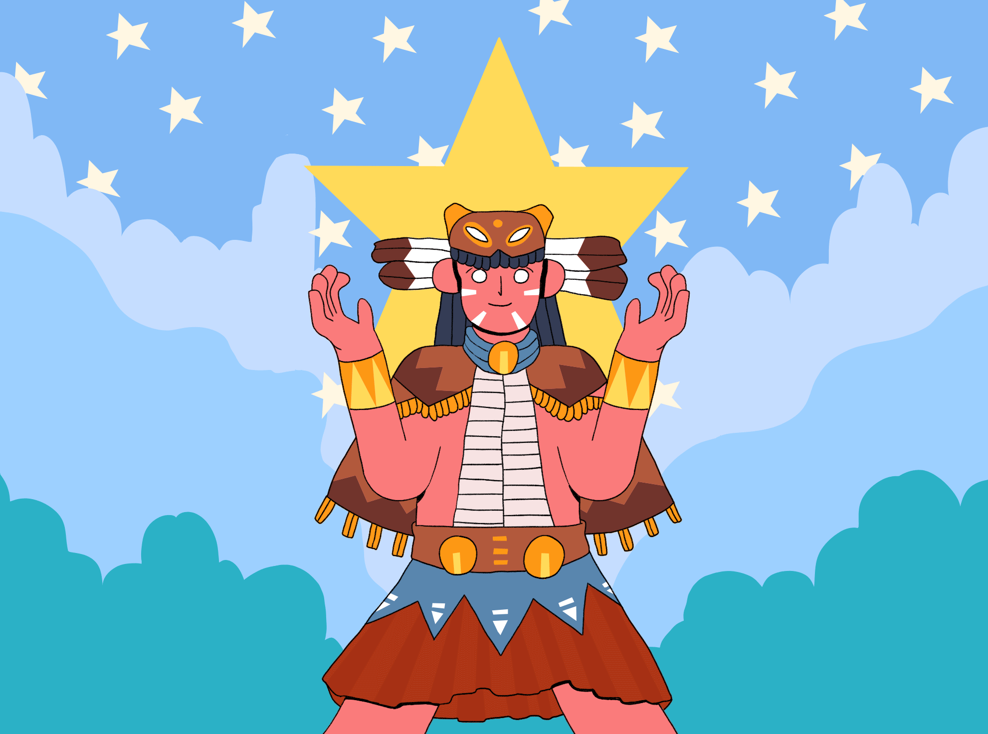
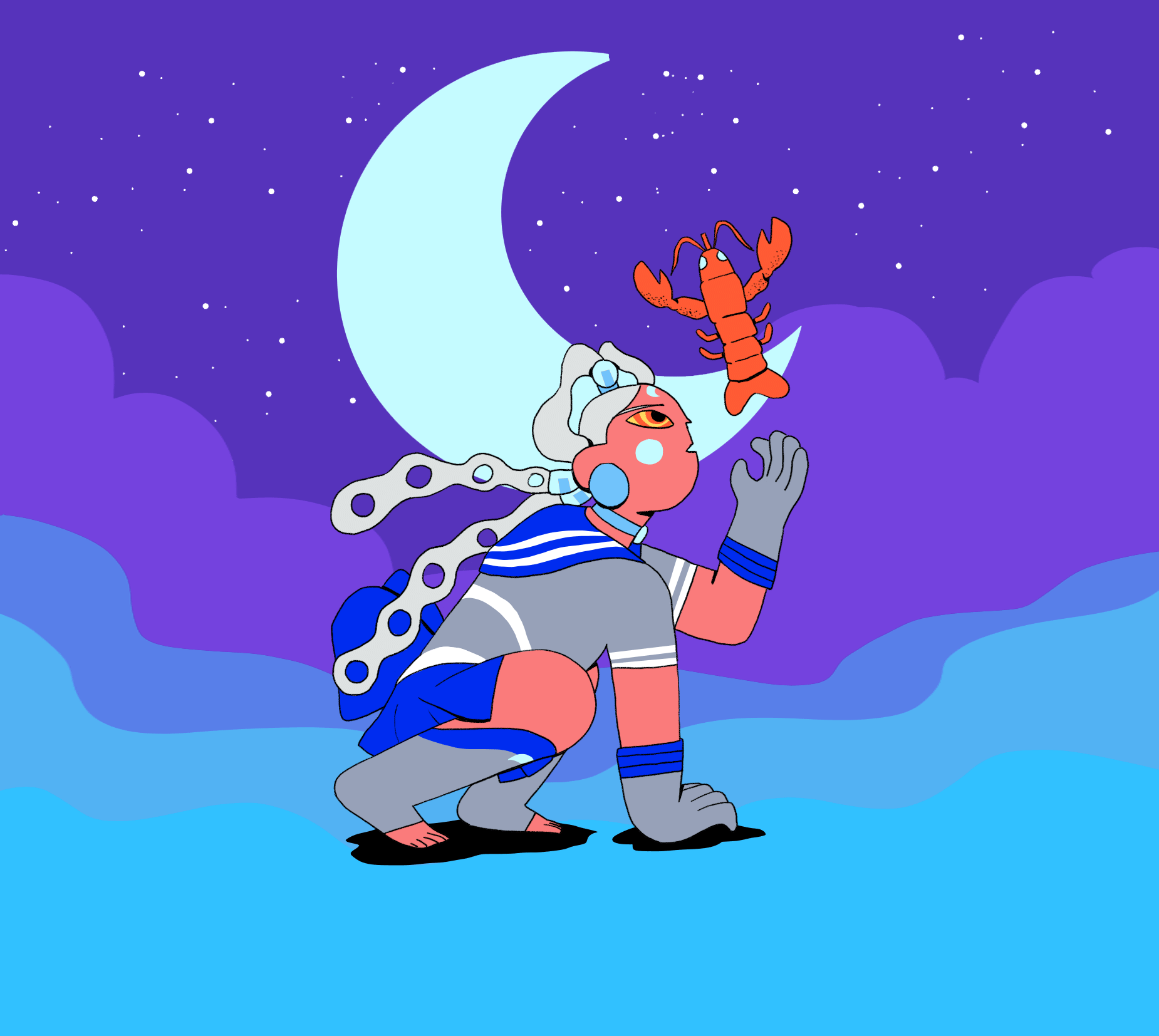
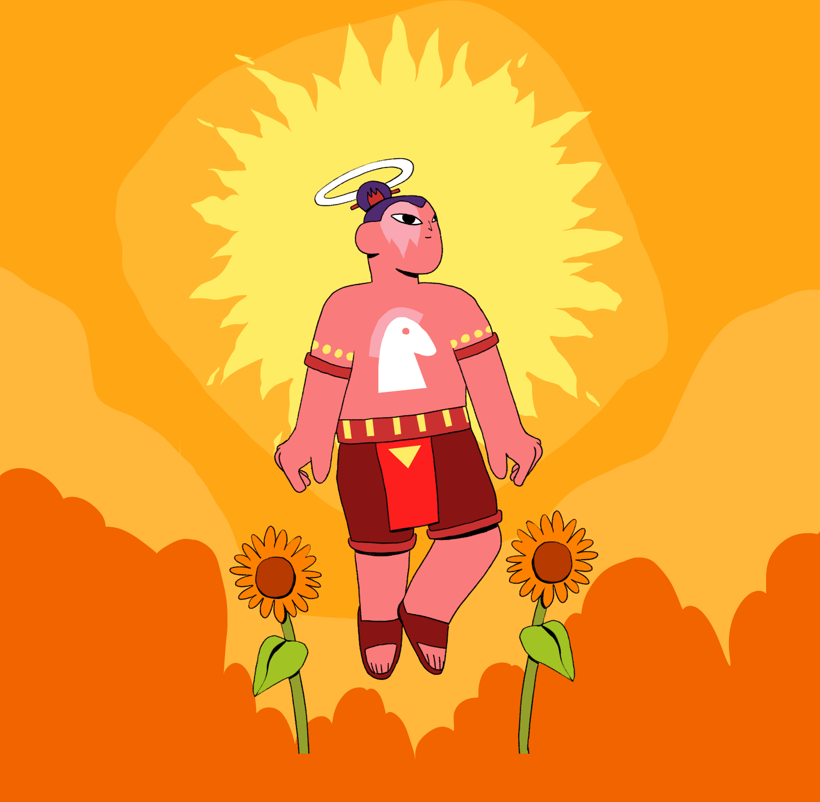
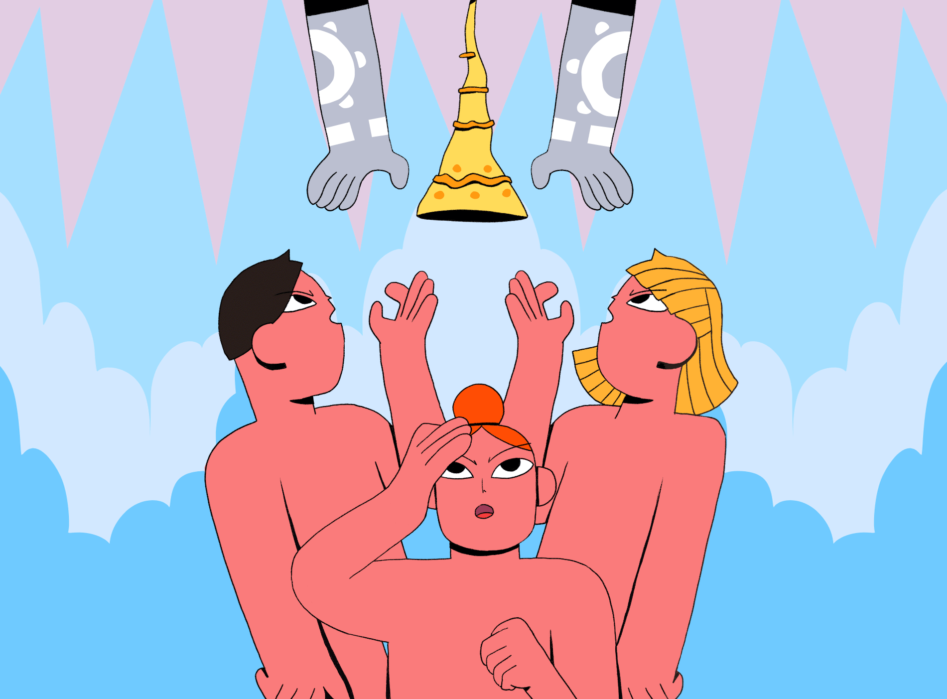
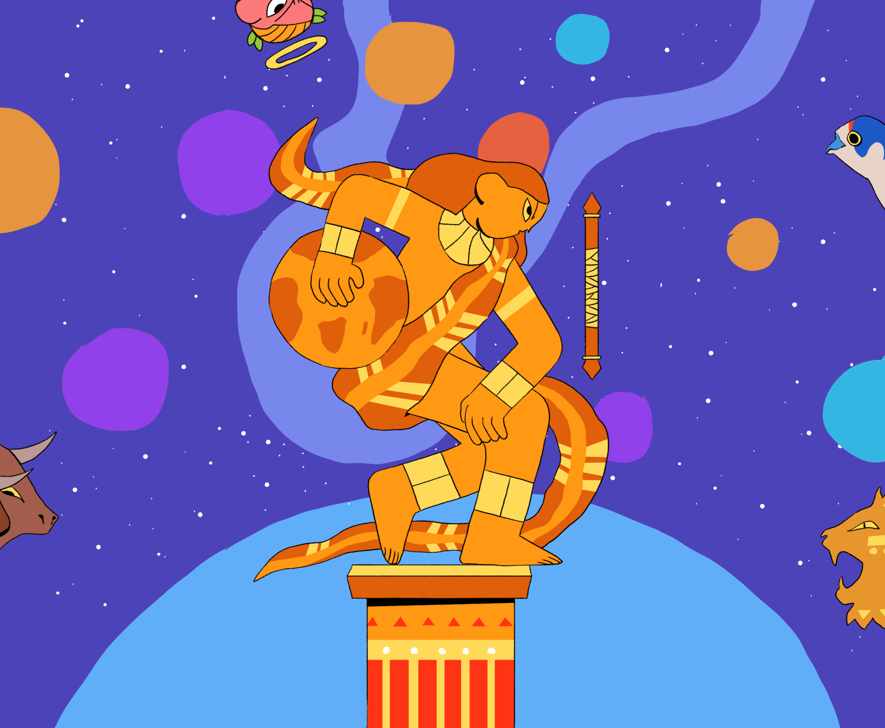
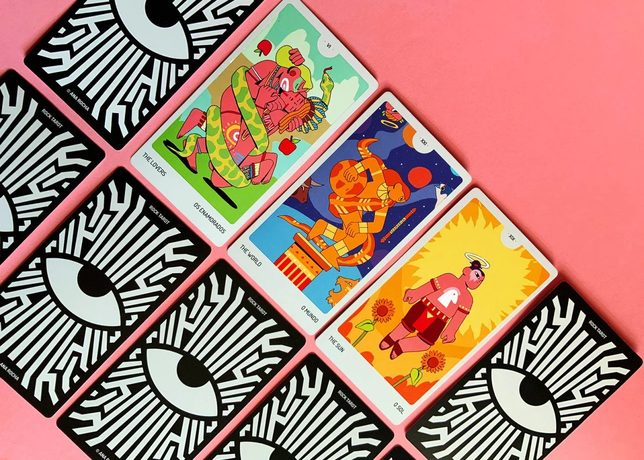
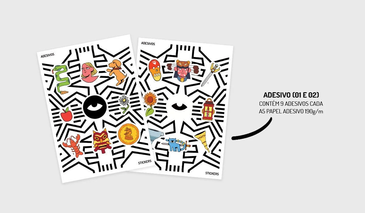
Each card draws inspiration from different moments in history and cultures around the world. From Ancient Egypt to contemporary Indigenous cultures, the visual journey moves across Asia, Rome, and Africa, travels through space, and dives into mythological underworlds. Alongside these historical references, I incorporated personal influences that have shaped me since childhood — especially animated series and films such as Dragon Ball, Naruto, Avatar: The Last Airbender, The Emperor’s New Groove, Totally Spies, Cinderella, and many others.
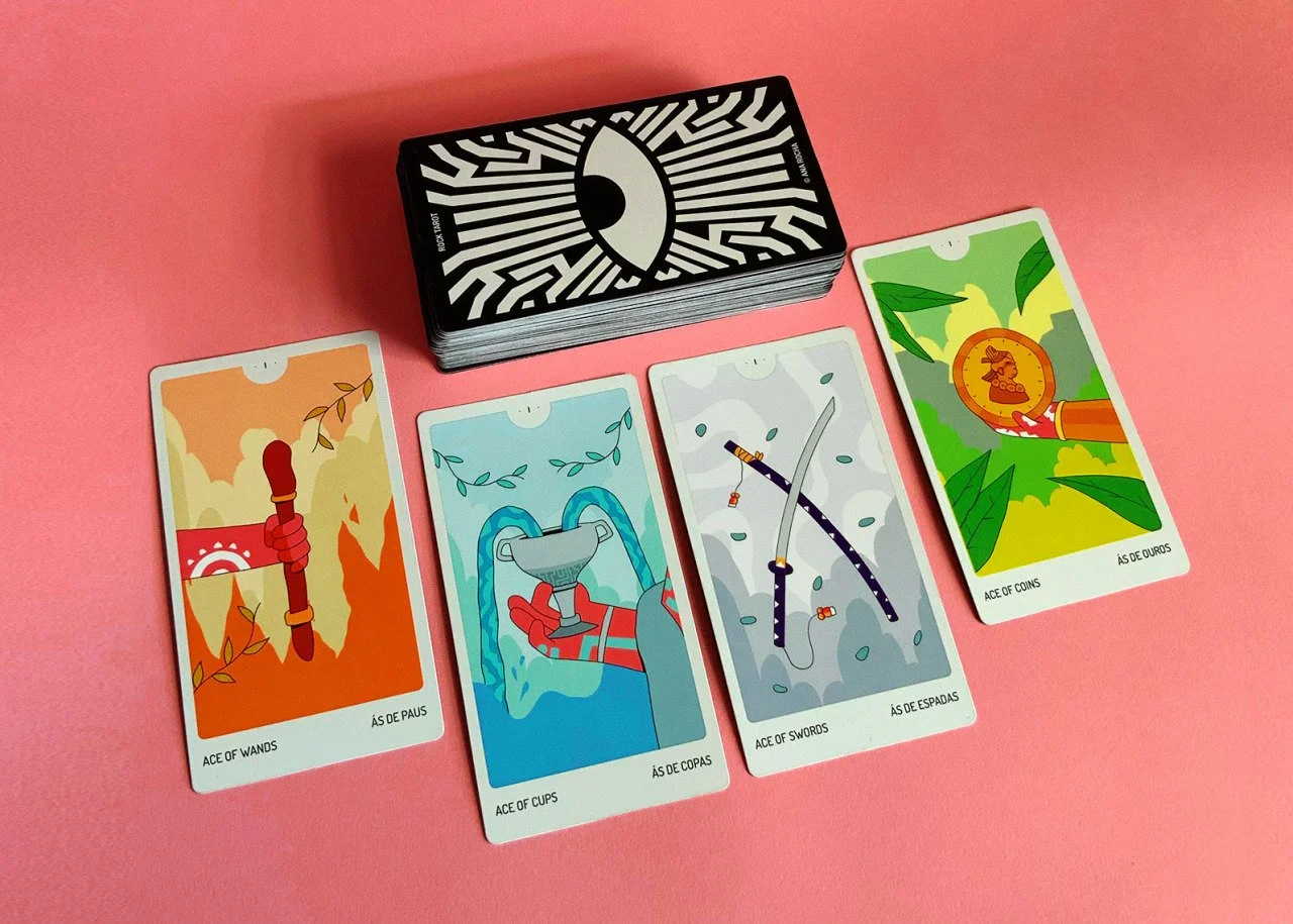
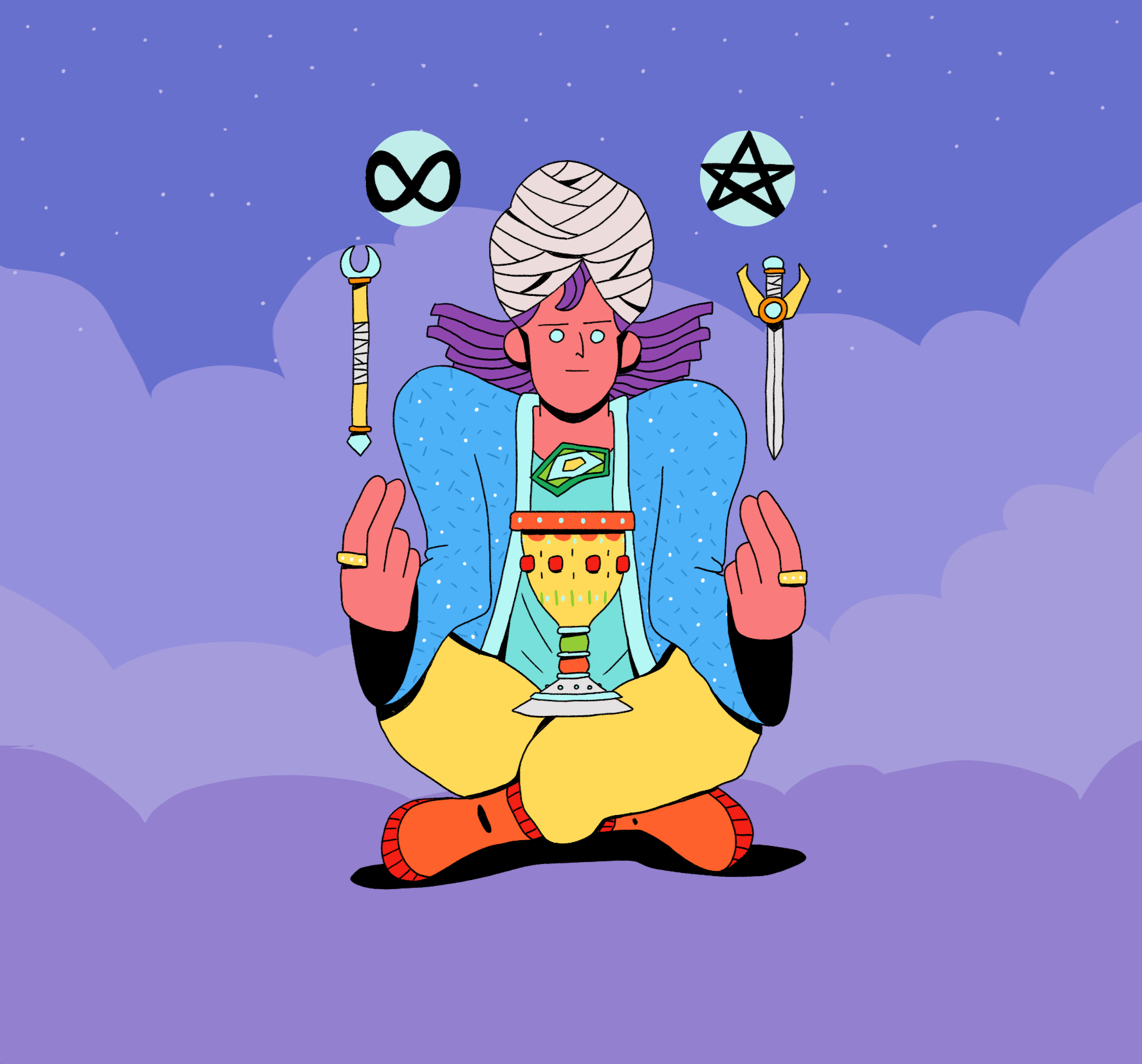
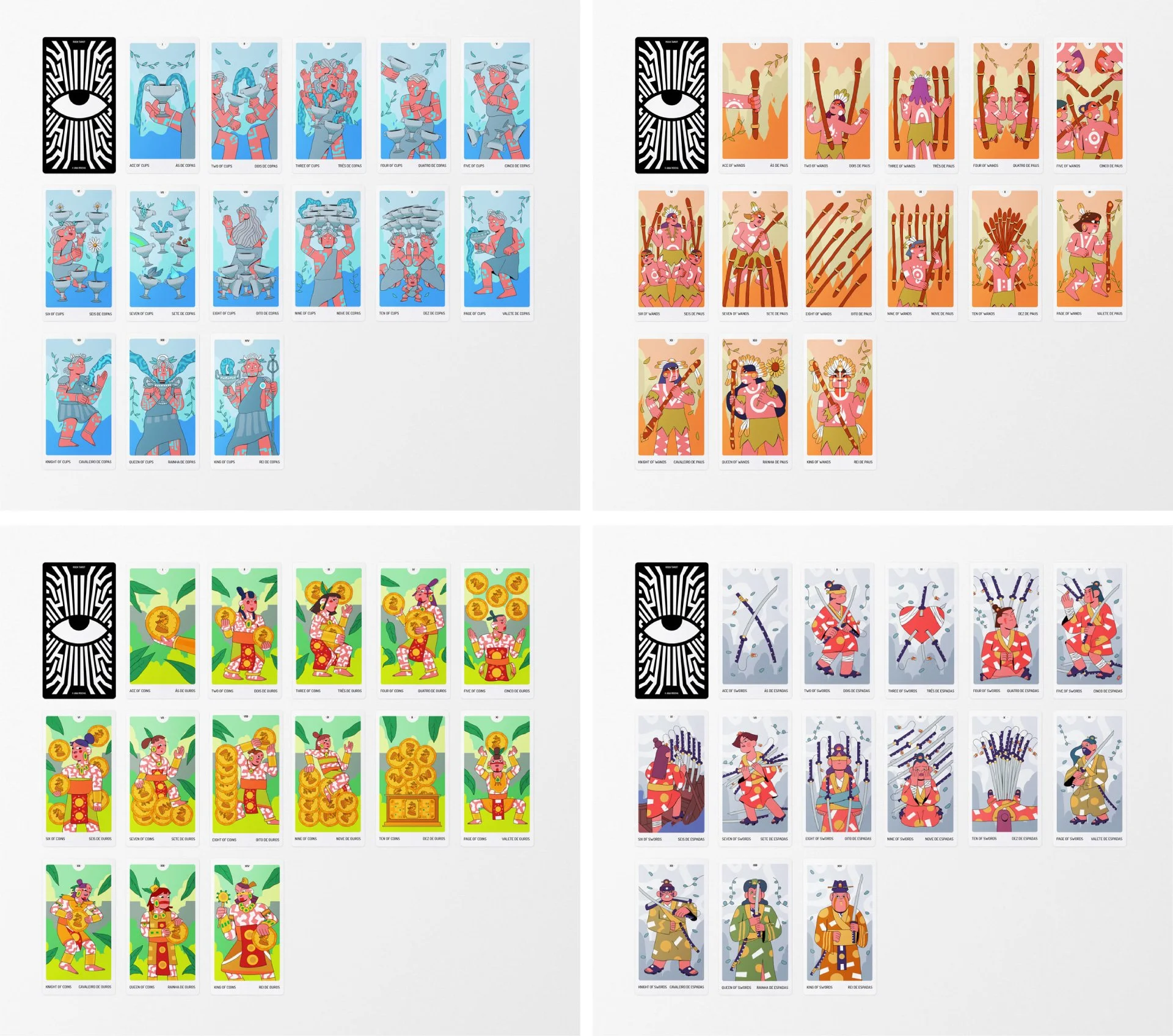
For the Minor Arcana, I adapted some of the references used in the Major Arcana and connected them to the four classical elements.
wands (fire) — inspired by Brazilian Indigenous cultures, representing the passionate and vibrant core of our land.
cups (water) — influenced by Ancient Greek mythology and the lost civilization of Atlantis, translating the emotional and spiritual depth associated with water.
swords (air) — inspired by Japanese ninjas and samurai — figures known for strategy, precision, and fluid movement.
coins (earth) — drawing from the Inca (Peru) and Muisca (Colombia) civilizations, reflecting groundedness, prosperity, and a deep connection to land and community.
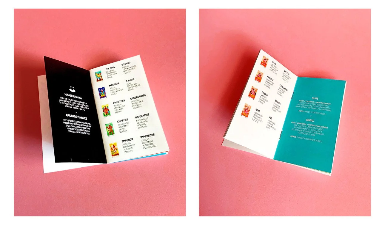
behind the cards
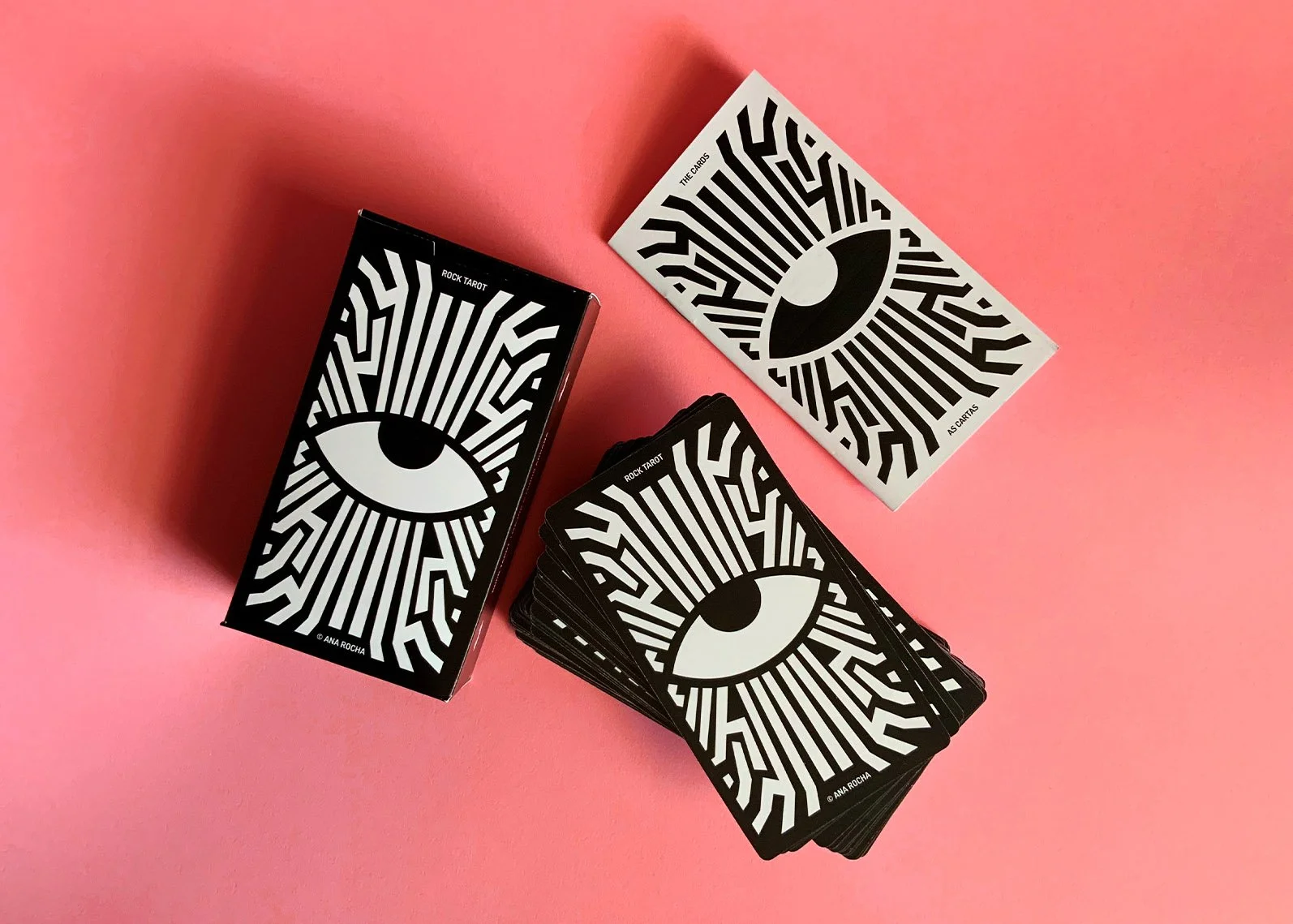
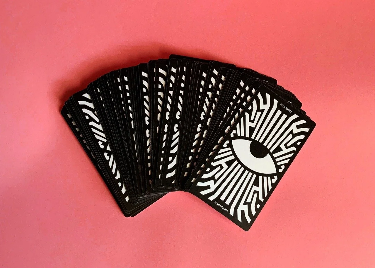
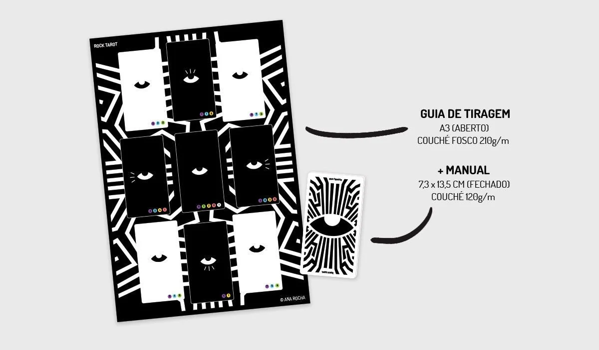
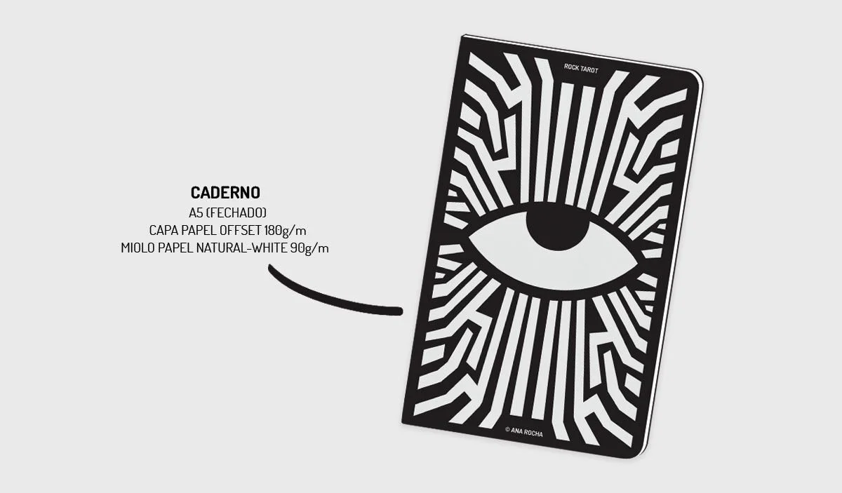
After completing the illustrations, I began developing the deck’s visual identity. I explored questions around packaging, structure, and whether a booklet should accompany the cards. Through experimentation and multiple sketches, I was reminded of a childhood reference — the concept of the “Heart of the Cards” from Yu-Gi-Oh!. The series featured mystical objects known as the Millennium Items; one of them, the Millennium Eye, allowed its user to see through others’ eyes and understand their deepest desires. I translated this idea visually through the Eye of Horus, an ancient Egyptian symbol representing protection and all-seeing awareness.
visual identity & packaging